
THE BRIEF
Industry brief set by JDO RAW exploring the intersection of Olympic sport and self-care. The task was to create a brand from scratch, name, identity, and packaging, for a product range that bridges athletic culture with the growing skincare market.
THE CONCEPT
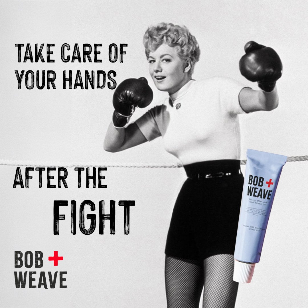
Boxing after-care sits in an overlooked gap, the sport demands a lot from your skin, and the recovery side of it is rarely talked about. Bob + Weave positions itself as the brand that takes the post-fight as seriously as the fight itself. Tough enough for the gym, considered enough for the bathroom shelf.
NAMING
Bob + Weave is a boxing technique, evasion, rhythm, control. As a brand name it carries all of that instantly, without needing explanation, while the "+" doubles as a first-aid cross and a quiet nod to the care and recovery angle. The name does the heavy lifting before the packaging even opens.


VISUAL LANGUAGE
The typography is rooted in woodblock letterpress and the chunky, distressed letterforms used on vintage fight night posters. It brings rawness and history to the brand without tipping into parody. Set against the soft pastel palette of the product labels, the contrast is deliberate: the brand is tough on the outside and gentle where it counts


PACKAGING
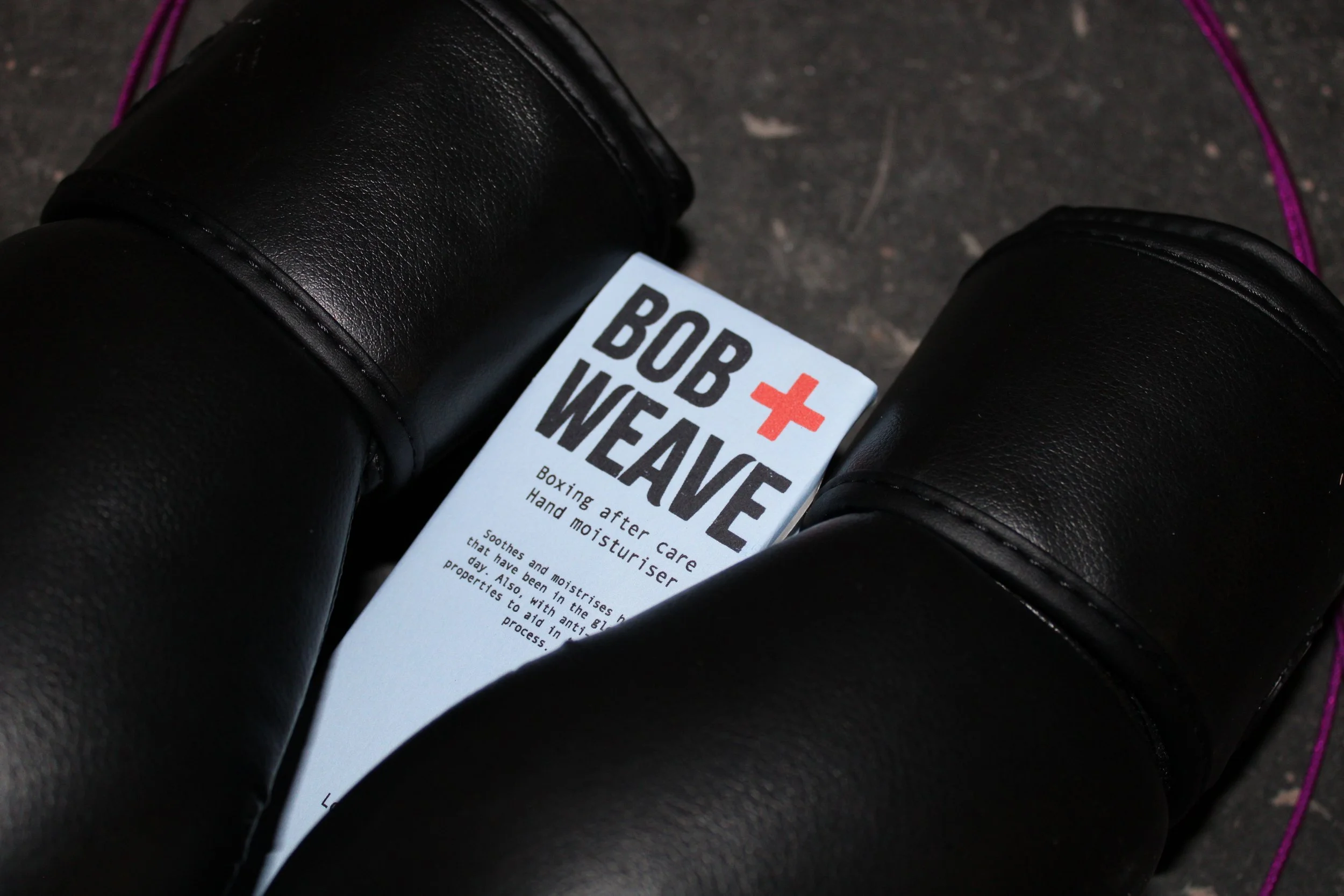
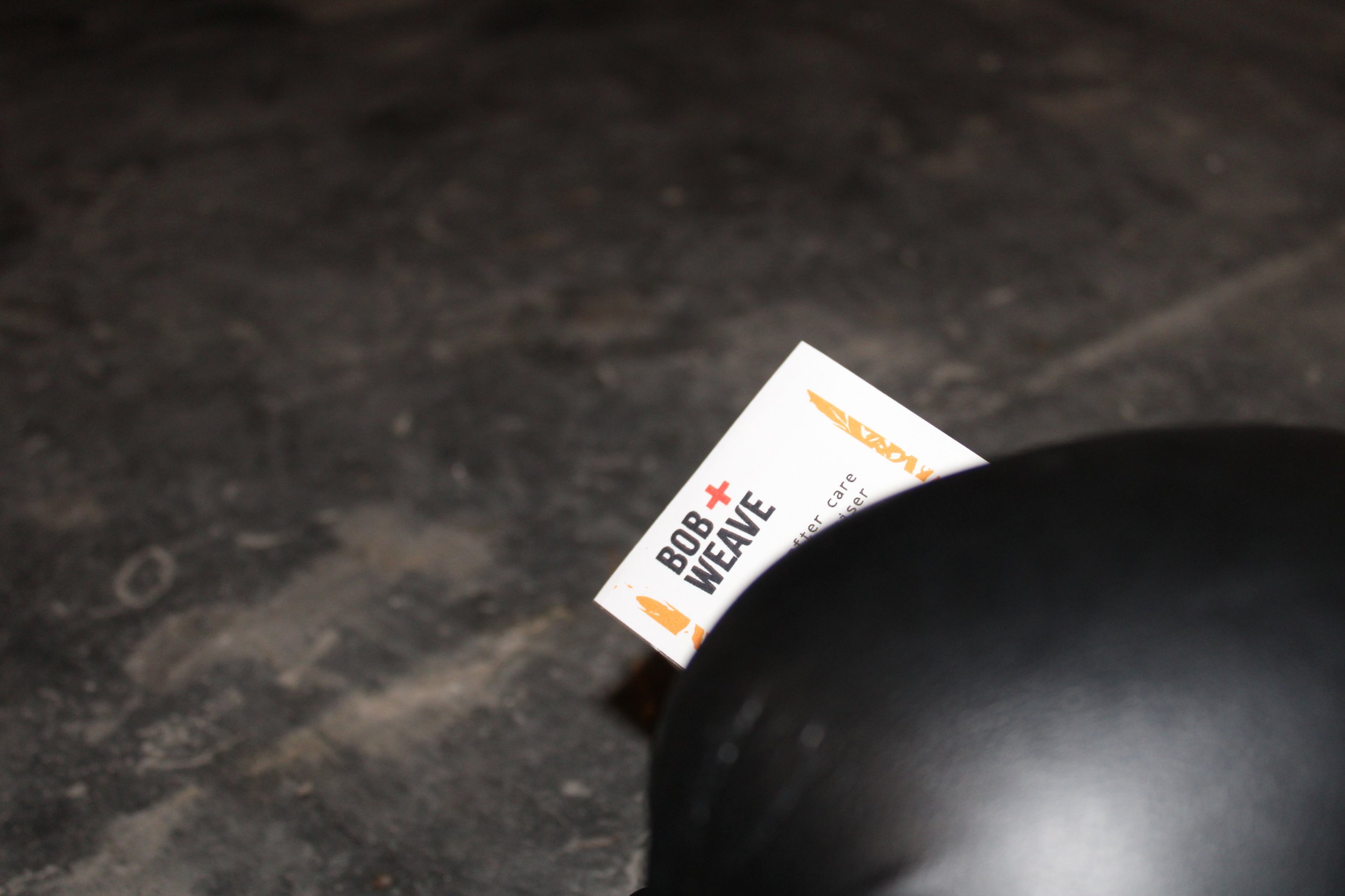
The product range, Lavender, Citrus, and Aloe Vera recovery oils, uses the full pastel palette to differentiate variants while keeping the logo and typographic system consistent across all three. Amber glass bottles add a pharmacy-meets-apothecary quality that reinforces the recovery positioning. Each label is calm and clean; the logo does the attitude work.
CAMPAIGN
The social campaign leans into vintage photography and tag-lines to speak to boxers in their own language. The black-and-white photography grounds the brand in boxing's heritage while the product placement pulls it squarely into the present. No softening, no wellness clichés. Just the brief, done honestly.