
THE BRIEF
A real commission opportunity pitched to a client through Leeds Arts University's live brief programme. A new sustainable golf apparel company needed a name and identity that balanced eco-conscious values with the precision and elegance the sport demands.
NAMING
Viridian is a specific shade of green — rich, precise, and historically associated with quality pigments and fine craft. It earns its sustainability credentials without spelling them out. For a golf apparel brand, it also lands on the fairway without trying too hard. The name does multiple jobs quietly.
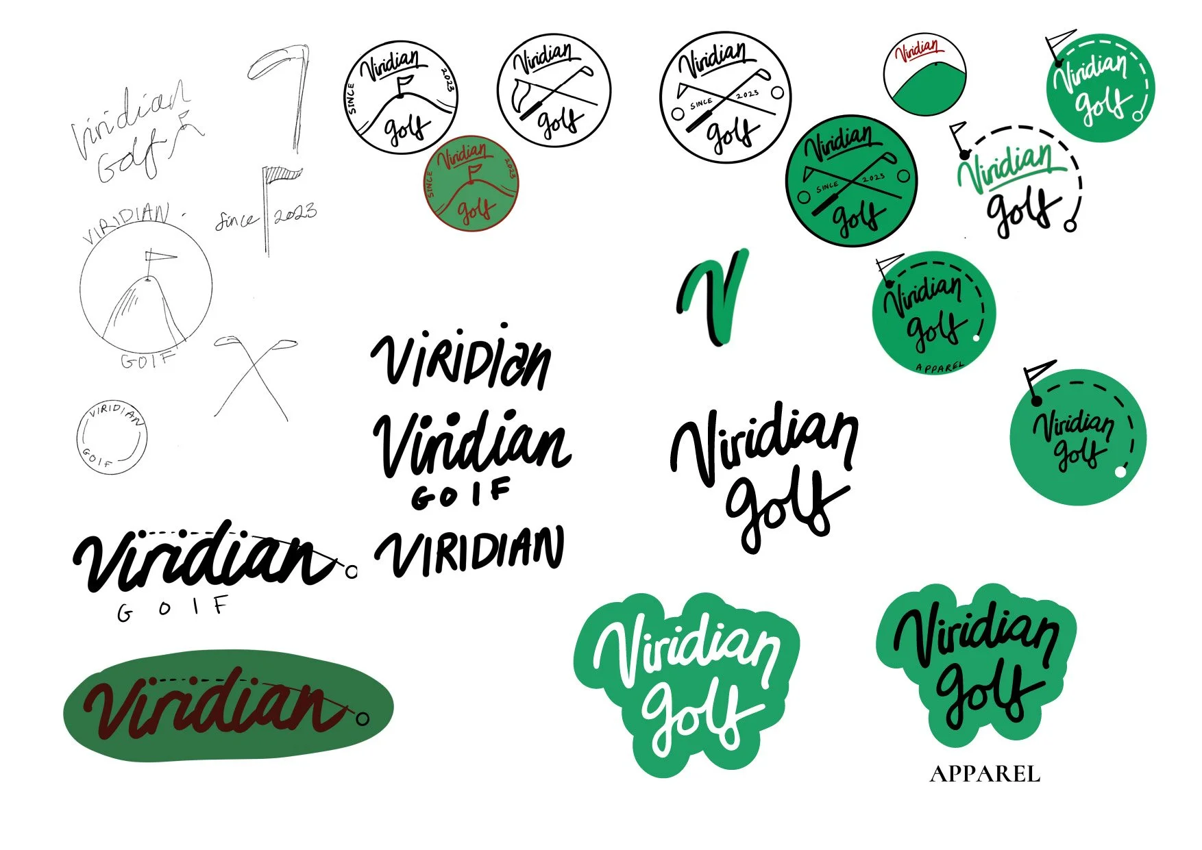
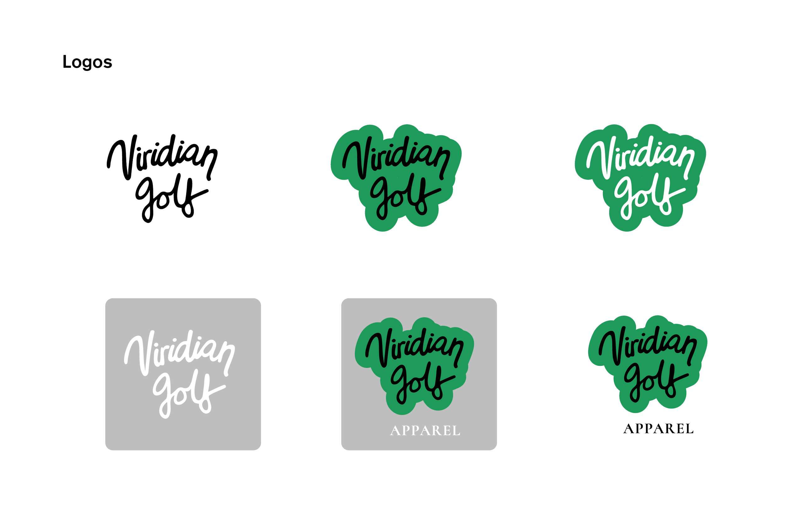


LOGO DEVELOPMENT
The process ran from rough sketches through to a finalised script wordmark, exploring badge formats, crossed-club motifs, flag iconography, and sticker-style treatments along the way. The hand-lettered style was chosen to bring warmth and personality. Golf can feel stiff; the logotype pushes back on that while keeping the craft front and centre.
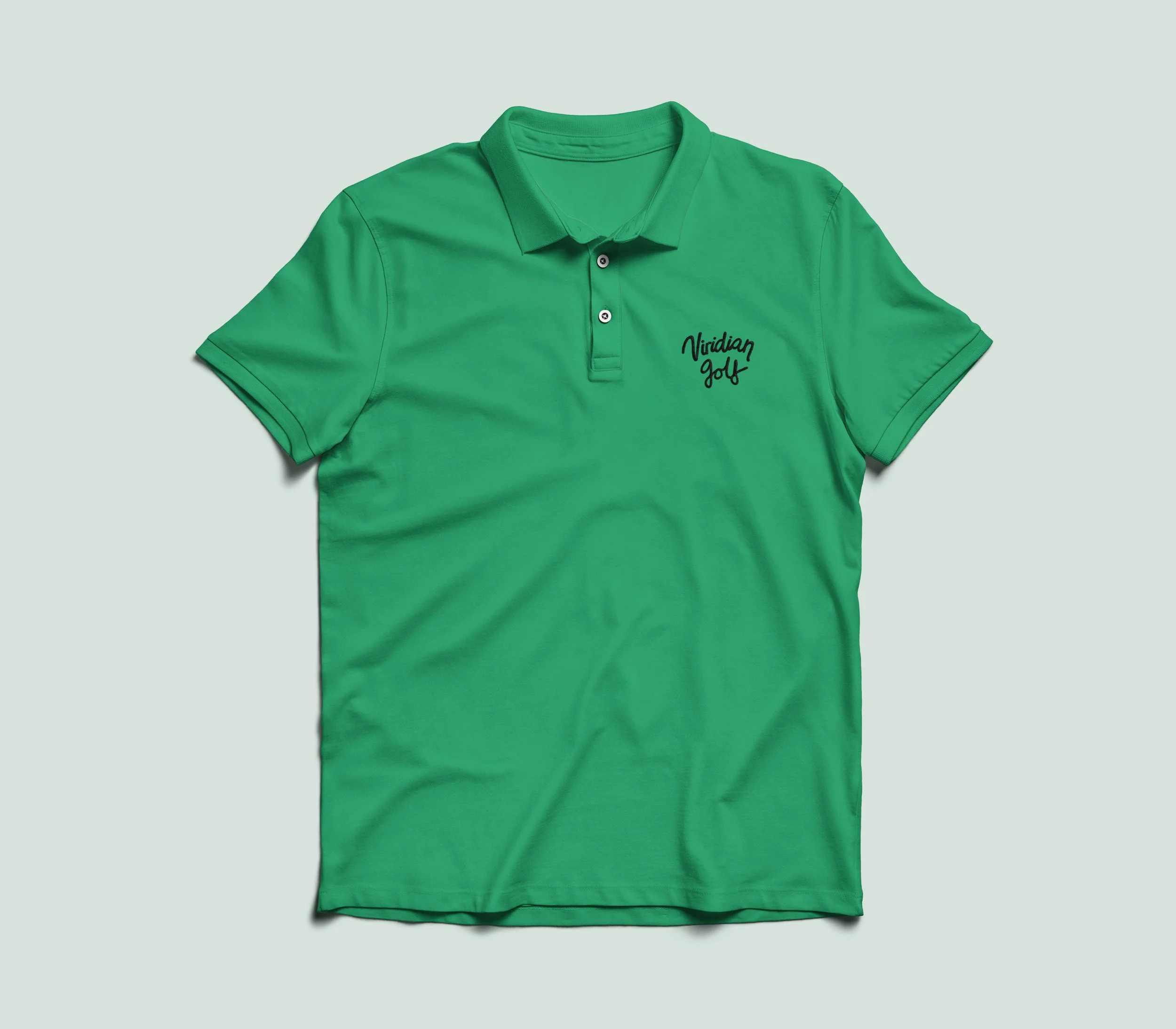
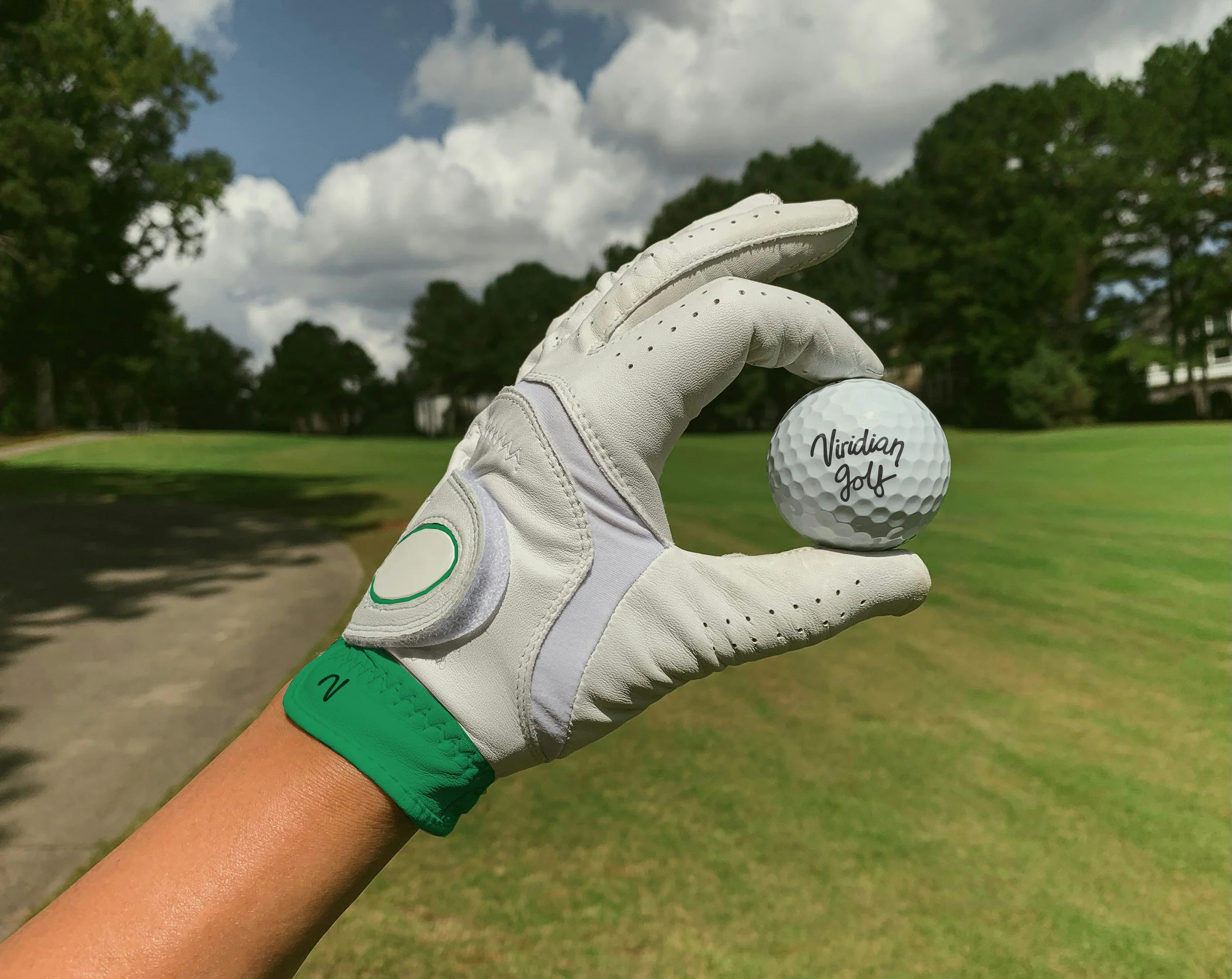
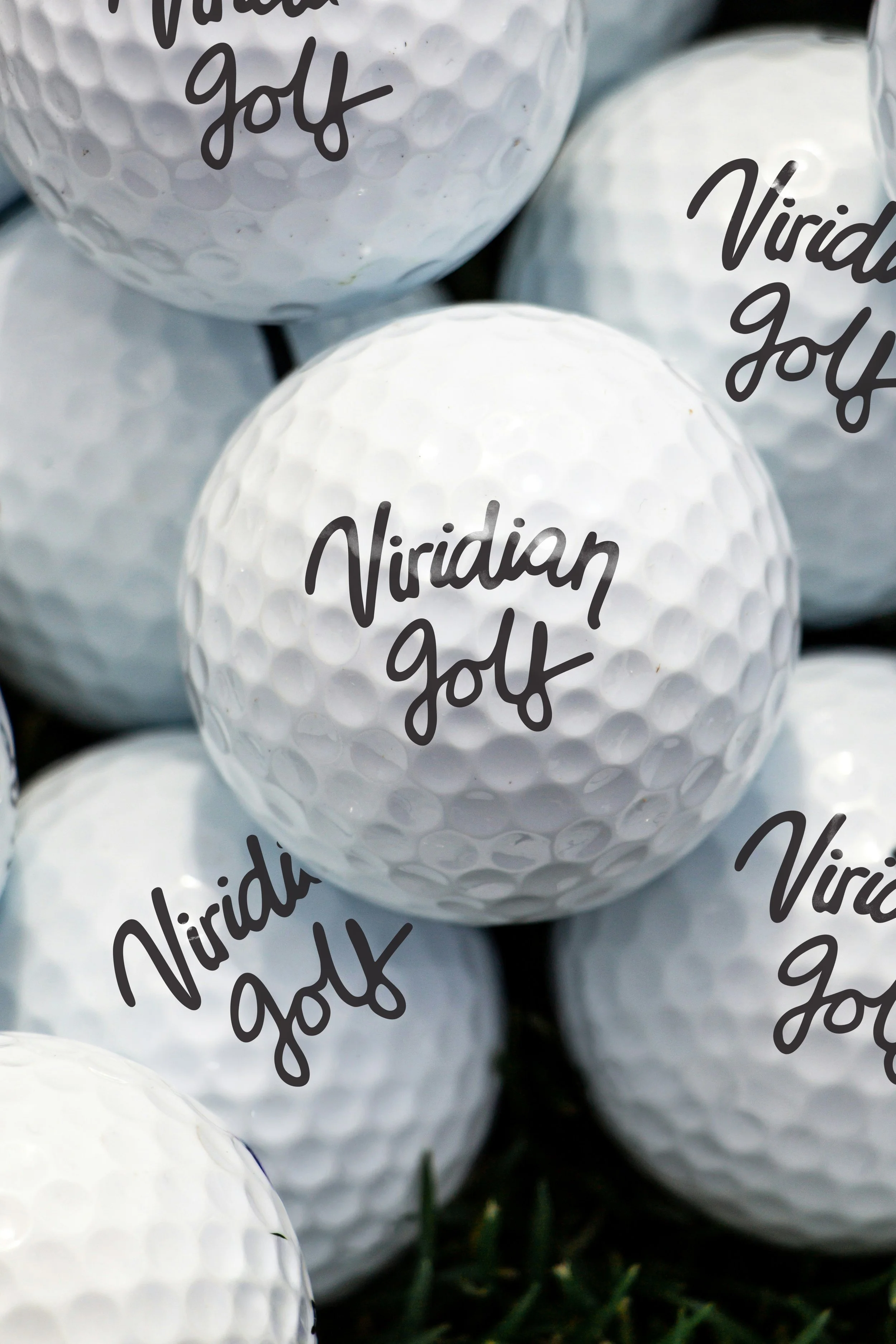
APPLIED IDENTITY
The mark was taken across two key touchpoints: embroidered chest placement on a viridian polo shirt, and stamped onto golf balls. Both demonstrate that the logotype holds at small scales and reads clearly on curved or textured surfaces, practical considerations the client would need to know before committing to production.